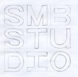
Below are the development ideas for the final logo.
I quite like the slick layout and grid that the type sits within. It gets across my designer name once read. It is easy to read even though the type is split up. Again there is the possibility that if i was to use this logo on a small scale say for a business card, it may become less recognizable and not legible.
I found with this design, by blocking out the centers of the letters, the eye is drawn to those letters and not the type as a whole, in which the hierarchy is disrupted and the name 'smbstudio' is not read in the correct manner.
As an add on to the above design of my design branding name i have incorporated the domain name into it to advertise the fact that i have a website. I think it works quite well as an advertisement and ties in well with the original design of my branding name.


